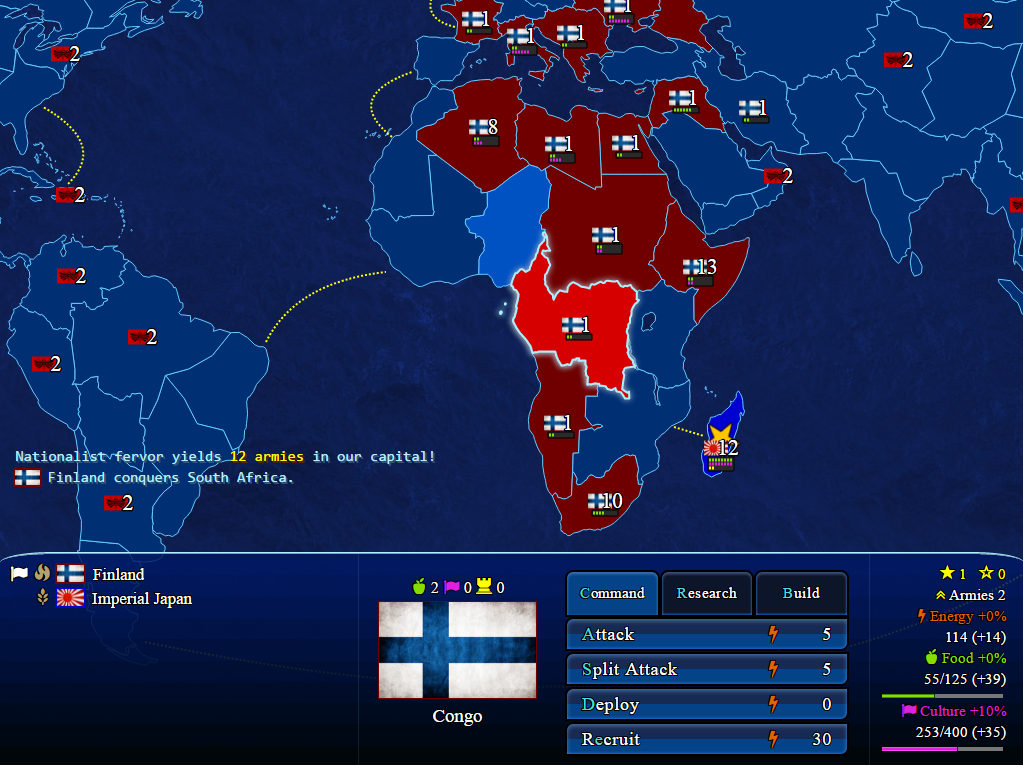
Previously the active tile scaled in the tile’s flag to indicate your current target. After a bit of research, I found a much better way to indicate your active tile: the glow filter! I double the border thickness and add a glow filter to the closed path which represents your current territory. This might sound simple, but it actually required some nifty z-index trickery to make the border always appear above its adjacent, overlapping tiles. By setting the xlink:href attribute of a use tag, I can choose which tile sits on top.
<use id="topTile" xlink:href="#land0"/>
I couldn’t be happier with the result. It works in Chrome and Firefox so far. I haven’t checked the rest, but if it’s good in those two, it’s usually good in all of the other browsers that matter.

