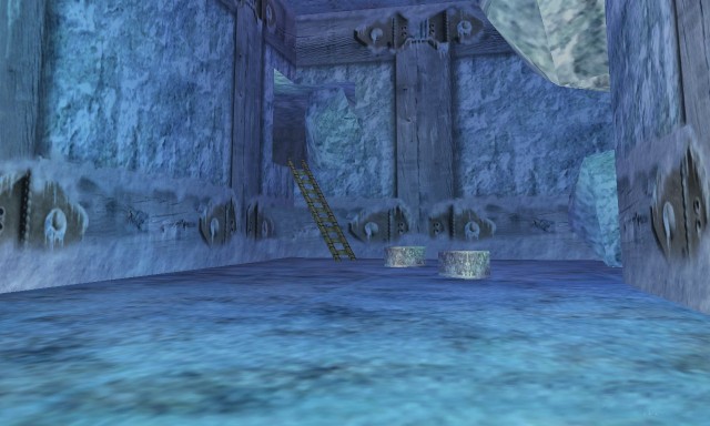
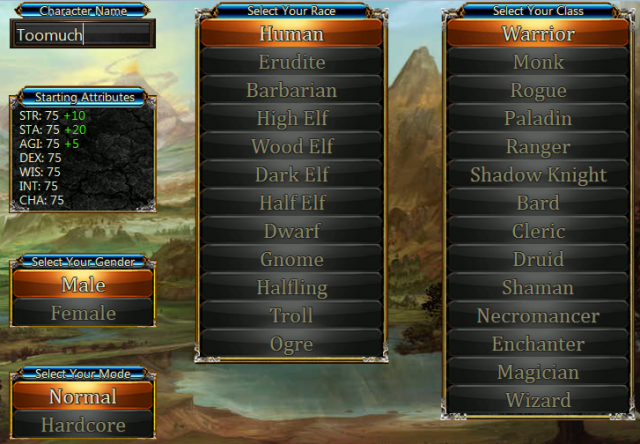
In the course of developing my first browser RPG, Nevergrind, I made a lot of decisions. Some good and some bad. However, on the whole, I did remarkably well at keeping development costs under control. Even Greg Micek of the Cliqist commented on Nevergrind’s financial efficiency. Nevergrind is an ambitious browser RPG chock-full of features including 12 races, 14 classes, three difficulty levels, hundreds of skills, talent trees, a plethora of items to discover, and four acts of gameplay. If I was careless, it would be easy to spend tens of thousands of dollars developing this game. However, I only spent $6,160.89 to develop it, not including web development costs such as web hosting, SSL certificates, and development tools.
In this article I’ll break down my lessons learned and highlight seven important tips to keep your costs down. Remember that 57% of indie games don’t make more than $500! The reality of indie game development is harsh, so you should plan accordingly. Nevergrind was lucky enough to break the $500 mark in its first month! And that’s not even counting the successful Kickstarter campaign! Here are seven strategies you can use to keep your costs down:
1. Establish an Art Style and Stick To It
This might seem like a no brainer, but planning your art style from the beginning is very important. If you end up having to re-do artwork, it will be costly in both time and labor. This is a mistake that I made that you can learn from! I completely changed the art direction of Nevergrind years into its development. This was due to starting out as a humble fangame with little to know planning at all. I just knew that I wanted to make a game similar to EverQuest in a browser.
If you are smarter than me and have enough sense to have a planning phase for your game, deciding on the art style is a big one because most of your costs will be predicated on what type of art style you want to have.
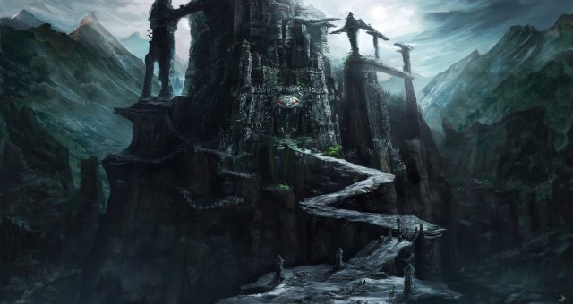
Don’t get exceedingly technical about the art direction. Think about art styles you like and what would work well for your game. Have a game or two that your artist can refer to for artistic direction. In my case I often provided my artist, Jocelyn Sarvida, with a landscape photo from classic EverQuest and advised her to put her own twist on it. Not exactly rocket science—but this worked well enough to get the job done.
2. Minimize the Scope of Your Game
For the love of all that is Holy, minimize the scope of your game. Chances are good that you will never even finish your game. If you don’t finish your game, you lose all of the time and money that you invested into the game. On the bright side, you probably did learn a few things along the way, but the goal here is to finish your game, generate some revenue, and cover your costs.
Again, I erred egregiously in this aspect when creating Nevergrind. Initially the game had more than 70 zones in an open world. I had enough sense to shrink this down to 47 zones. However, this was still way too many! I probably should have reduced the scope another 60% to make it a bit more reasonable for a first game. Designing talent trees and skills for 12 races and 14 different classes is a TON of work. That’s why you will probably find zero games on the App Store that offer that many choices. I haven’t checked, but I bet it’s zero!
But that’s not all—way more features should have been cut! Including the insane level 99 cap which should have been kept at level 50 for its initial release. Almost 1,000 unique items? Drop it to 250. Forty-five unique monsters? Drop it to 20 instead! Nightmare and hell difficulty? Dump it. Hardcore mode? Dump it. Over 90 item properties? Drop it by 75%. Just way too much for a first game.
“But Joe”, you say! “Nevergrind was successful for these reasons!” Well, that’s debatable. I personally think that I succeeded in spite of these reasons. I think if the game had 5 races, 7 classes, 250 items, level 50 cap, 24 zones, and 20 monsters I could have enjoyed roughly the same amount of success.
I’m not saying that your game has to be small for eternity. It’s quite possible to design a bare bones version of the game you want and design it to scale horizontally and vertically with ease. If the game is a great success then consider adding new classes, nightmare difficulty, raising the level cap, extra zones, and so on!
3. Discover International Talent on Upwork
There are people on Upwork that will hit it out of the park for $8 an hour. Upwork is a place to find freelancers for all sorts of jobs such as graphic design, web development, and more. Fedor Sosnin of Disruptive clued me in to the wonders of Upwork back when it was still called oDesk.
Now, your milage may vary. Hiring on Upwork requires both luck and discernment. If you’ve never hired somebody before, I assure you that hiring via Upwork will change your perspective on employer-employee relationships for the rest of your life. Most people spend their entire life without experiencing the employer side of the relationship. In my experience I gained a great deal of empathy for employers. Procuring niche talent for any project is mired with pitfalls!
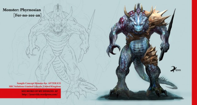
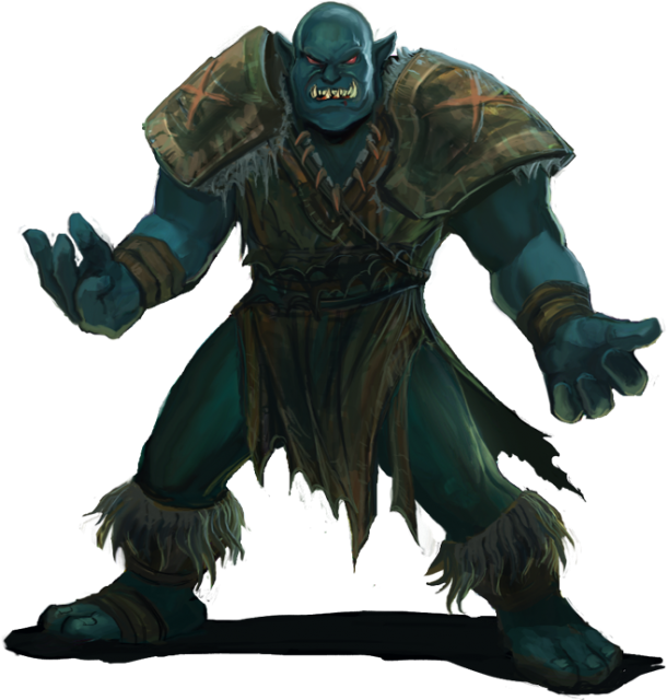
Nevergrind’s main artist, Jocelyn Sarvida, ended up costing 64% of my total budget. She drew all of the monsters and the backgrounds in the game. After reviewing her portfolio and seeing some of the artwork on her blog, I knew that she was the right choice for the job. She was an absolute steal at $9 an hour! I saw her work on landscapes and monsters and I just knew that she was the one for the job. It almost felt like destiny.
4. Decide on Quantity vs Quality
Nevergrind has one glaring flaw that really bugs me: the monsters don’t have more than one frame of animation. In a perfect world I would have been able to afford multiple frames of animation for 45 monsters, but that simply isn’t possible on a 4-figure budget. I clearly opted to go with quantity due to the overreaching scope of the game.
This intersects with tip #2 heavily and you carefully consider what is important for your game to succeed. Do you need multiple frames of animation? If you do remember that it will get expensive. On an indie budget, you can probably afford quanity or quality, but not both.
Note that a lot of animations are free using canvas animations: flip vertically, flip horizontally, rotations, skew X, skew Y, opacity, and x/y movement. I use all of these so that my game looks like Phantasy Star III instead of Phantasy Star I.
5. Leverage Open Source Artwork
If you’re lucky you can find some suitable free game artwork on popular websites like Open Game Art. Check it out and pay close attention to the artist’s license on the artwork. Many are quite lenient, but some require attribution or payment if you monetize your game. I managed to discover Matthew Pablo there and I ended up paying $600 for the fantastic music that you hear in the game. I paid $60 for permission to use each open source track in the game. Interestingly, he said that he would charge $120 for completely original tracks. This is a great value if you have room in your budget!
There are a lot of other places to check for free art assets, too. Bust out your google fu and try searching “free game assets reddit”. I have seen threads multiple times on reddit where artists simply give away a ton of free game art. They even have an entire subreddit specifically for free game assets. For example, I managed to find this thread with thousands of free assets using a brief google search. A little more digging using a variety of keywords is sure to unearth plenty of gems!
6. Create Simple Artwork Using Canvas
Canvas is a powerful HTML5 feature that allows you to draw graphics on a webpage. Canvas isn’t required to make a cool webgame, but it certainly can make it more performant. It can also draw vectors and various unusual shapes such as stars, octagons, and rhombi. It can even draw graphics using free form methods such as .arcTo() and .quadraticCurveTo().
There are several benefits to using these methods:
- You don’t have to download any images.
- You can cache them for rapid copying at any time.
- Modifying the images is dead simple. GIMP/Photoshop not required.
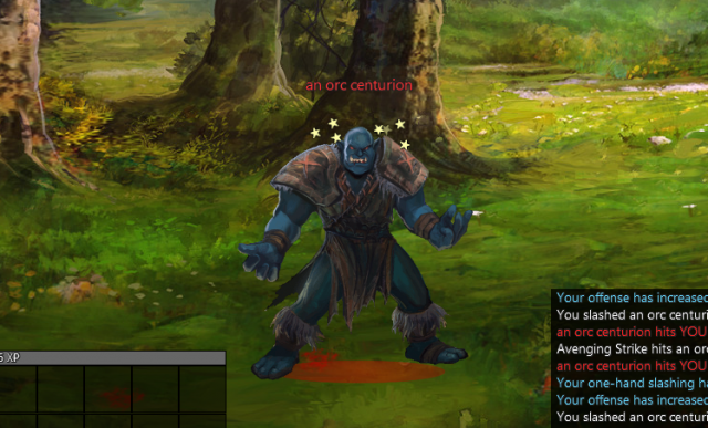
Here’s a simple example of the stars I used to indicate that a mob is stunned:
7. Unleash the Power of CSS3
CSS3 offers a powerful range of capabilities including linear gradients, radial gradients, fancy text shadows, box shadows, and more. One of my favorite tricks is using multiple text or box shadows on the same element. There is a lot of room for creativity when using CSS3. For example, I spent a lot of time getting the text shadows in Nevergrind to look just right. I must have had dozens of iterations trying to get the text shadows to look just right. Sure, I could give it a 1px 1px #111 text shadow and call it a day, but what if I want text that looks more like something you’d see in a real video game?
You can also be very clever using multiple box shadows, which can be either inset or outset. I’m not the world’s foremost box shadow wizard, but looking closely at the example below, you can see the subtle improvements provided by clever use of multiple box shadows:

Look at the top and bottom of the navigation buttons. Subtle but sexy! “The Nevergrounds” also employs an effective text shadow.
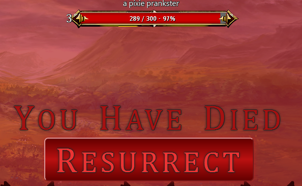
Skilled use of these CSS3 features can help keep your costs down by smoothing out some of the ugly corners of your browser game. Gradients and shadows take a lot of practice to use effectively, but it’s definitely worth the effort. As an example, I ended up using simple gradients on my health bars. Originally I was using images created by the UI artist, but I ended up opting for gradients anyhow since they reduced bandwidth and only cost a few lines of CSS.
Conclusion
Using these strategies helped me keep costs down and helped make my first game relatively successful. With a little luck, I may even turn a profit in my first year. Hopefully you can use some of the my insights to create a low-budget game of your own! If you found my strategies useful let me know in the comments below! Any feedback is appreciated.

